

New Print Profile: Do Good Work
Fresh off the press and ready to ship!

I like to say that I care about two things: fonts & creatives. And this new print brings both those things together in a beautiful way!
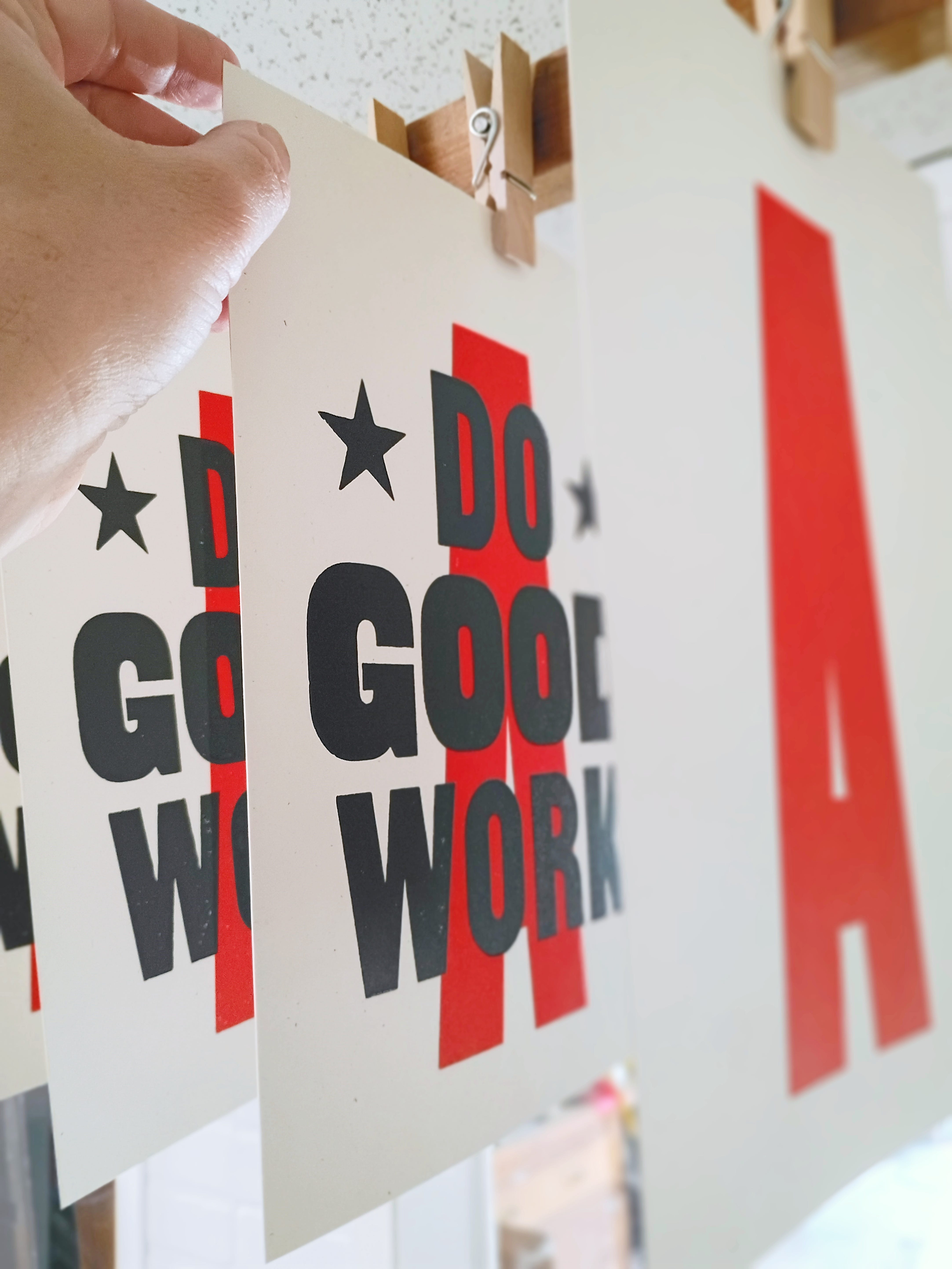
Do Good Work
This is one of those prints that I’ve made as much for myself as for you - other people that create things like graphic designs, or paintings, or photos, or families, or communities. Although it’s a moving target, I really want to do good work. Work that is well made and exhibits an attention to detail. Work that is better than the work before. Work that makes a small difference in the world.
I probably say it too often, but I believe it at least for right now: this might be my best print yet. The type contrasts and organization, the ink application, the composition, the vintage vibe. I’m incredibly happy with it!
These prints were entirely hand-inked and hand-printed, with no automation. The three colors of the A were individually printed, one at a time, and partially dried before setting the type on the press bed and again hand-inking and hand-pressing the message in a custom mixed and very dark gray ink.
Do Good Work is available in three limited editions and will not be reprinted in the same way again. There were only 17 Red, 15 Green, and 17 Blue crafted in this design.


Design Notes
Although it looks like a simple composition, there’s a few details that I think really make it work well.
First, the colored “A” in the background is a strong, bold shape and reminds me of “Grade-A Quality” from vintage advertising and branding. The A is also slightly elevated in the composition to provide “lift,” and of course the triangular form nicely moves the eye upward in the composition. Additionally, the colors have a retro feel to them, in fact I was inspired by the colors in a vintage card game that have captivated me for several years. (I may need to make a post on that later, they are very cool designs!)
Secondly, the foreground text, printed in a second, overlapping color pass reveals just the slightest transparency and luster shift when the ink moves from overlapping the A to the clean, unprinted surface.
The text uses two fonts — A fairly neutral sans serif font for “DO” and “WORK,“ and in a wider but almost monospaced, bold font for “GOOD.” This subtle contrast provides nice visual variation, but not too much by keeping them in a similar style.
As unassuming as these letters and layout may seem, it required a fair amount of careful attention to the letter-spacing so that they would feel evenly placed.


The Adjustments
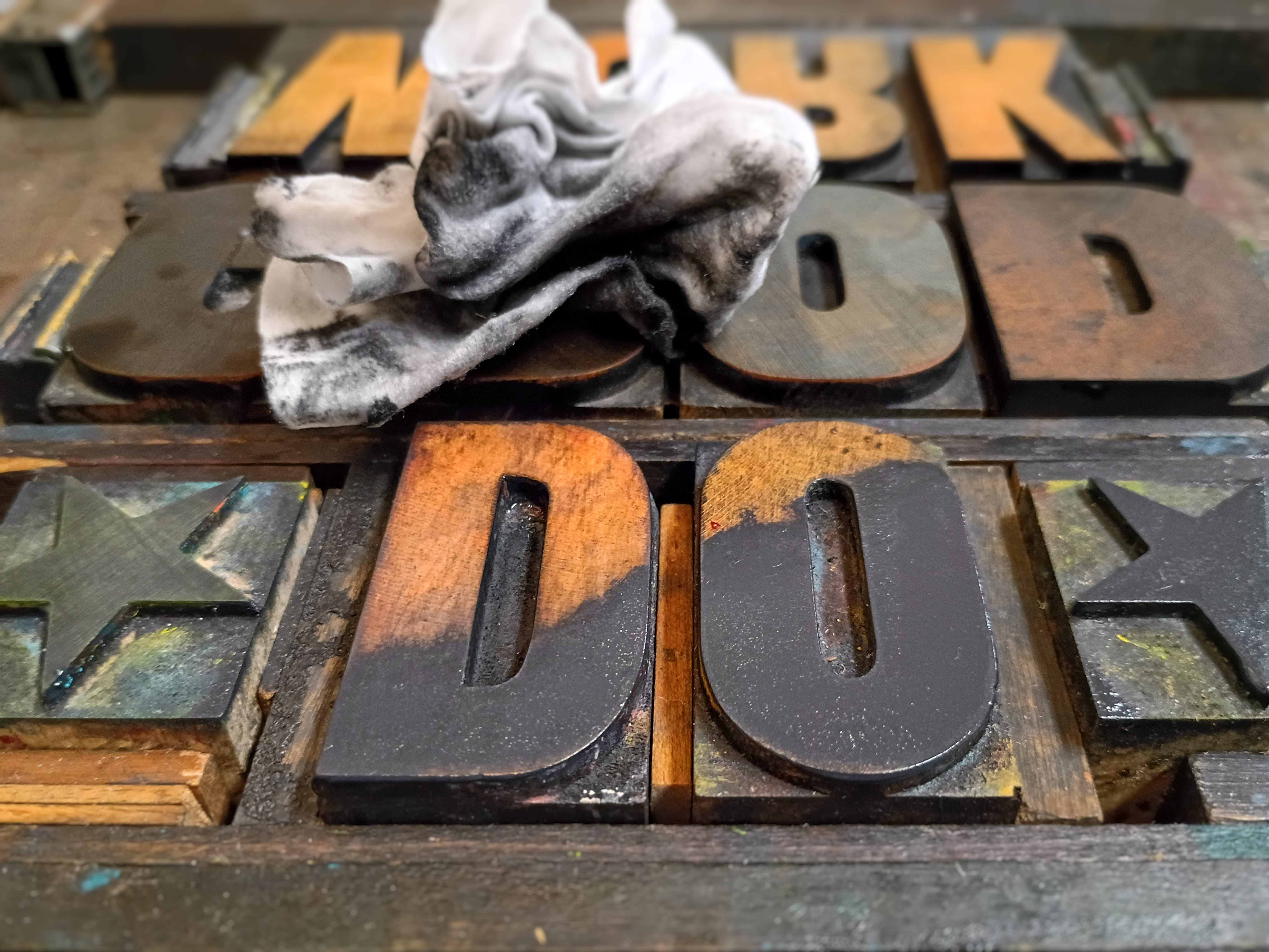
In most digital typography, kerning pairs (the particular spacing between particular letters) is pre-programmed into a font. But in analog, letterpress graphic design, spacing is achieved by hand using custom cut strips of wood or metal, and in my studio also mat-board, and a variety of paper weights. There isn’t as much “math” or regularity to this finishing touch as there is intuition, honed from years of observing and working with letterforms. Kerning is a favorite passion of many graphic designers, and one of the elements that subtly elevates typographic work.
For instance, the star on the right is slightly closer to the O than the star and the D, because the D faces the star with a straight edge, but the O has empty “corners” and that is compensated for by nudging the star closer by about 1/6 of an inch (or one “line.”)
For “WORK” the W block is placed closest to the O, because of the large negative space under the W. And for consistency and visual repetition, the O/R/K spacing is repeated above in “DO.”
In contrast, the spacing of “GOOD” is distributed equally because the letterforms have such similar, rectangular forms.
And a side note: the A is not a perfectly symmetrical form, as is often the case. Many typefaces have a calligraphic bias, meaning one of the vertical strokes is often heavier, as is seen in the right hand stroke of this A. I didn’t design this letterform, that block is an antique printing block I recently acquired, but I thought other designers and calligraphers might be interested in this aspect.


Available for Purchase
These prints are listed and ready to ship in my Etsy shop!
You can view this print and other still available prints here:
Would you help my creative practice grow?
I’d really love to get up to 1,000 subscribers…I’m about 125 away.
But in order for that to happen, I need more people here on Substack and beyond to see my work.
Here’s easy ways you can help:
Be intentional about liking my Notes and Articles
Commenting on Notes and Articles
Sharing Notes and Articles
…and if you’re really feeling generous, pledging to be a paid subscriber to my newsletter. I’m not sure when I’ll turn subscriptions on, but I hope to soon. I really need to start making a little bit of money from writing on Substack to justify the time trying to make quality Notes and Articles.
Thank you! I really mean it — your support matters more than you know for me and my family and my small, rural letterpress studio!
-Daniel
Thanks for the Restack @Nathaniel Roy . Seems like a good print for anyone with a new office! 😉
Swoonworthy description and explanation of the fonts and k er nin g! And now I know you have an Etsy shop, where I've already tagged a few posters.