Notes on Order in Design
Unseen design decisions and considerations in my latest print
If you’ve ever taken a class on Design you’ve likely come across the idea of positive and negative space. As a refresher, the positive spaces are the areas that contain something like a headline, or a paragraph, a photo, or ornamentation. Negative space is then the areas that are “unused” and provide the eye and mind a space to rest in the composition.
For my latest print release, there are a few hidden details in the unused and used spaces I thought I would highlight.
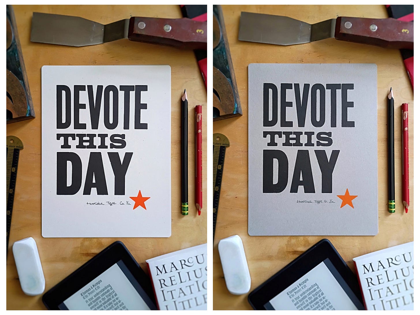
Devote this Day
The concept for this print had been on my mind for most of the summer.
I have been finding myself being too often distracted and not having a singular focus for my days and time. Additionally, I am becoming increasingly aware of how notifications from devices are taking over my day as well - constantly and suddenly pulling me out of whatever task was at hand and I lose focus and productivity.
So, the idea for a print to encourage us all to focus and dedicate our days toward a singular goal or ideal came about, to offer our time to something greater than ourselves: Devote this Day!
Letter Spacing
I take pride in my attention to letterspacing. It’s one of the ways I can invest in elevating the craftsmanship behind my prints to make the final design something special.
The basic concept is simple, but the practice is complicated.
Essentially, for most typefaces and fonts, the type should be set in a way in which the letters appear to be equally spaced. This is often referred to as “optical spacing,” as opposed to “metric spacing” which would be applying the exact same space between the extreme left and extreme right edge of each character.
The best way I have heard this described is to imagine a series of identical, flexible balloons of sand squeezed between the forms of each letter. That balloon will require different space between and H and H than an A and O. The H’s will be more spread out, whereas the A and O need placed more closely together.
For the Devote This Day print there are a couple custom kerning solutions.
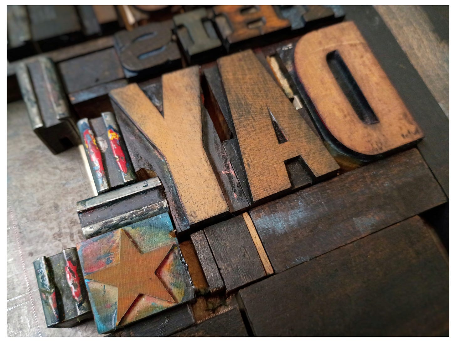
First, the A/Y in DAY, which is always a problematic pair. You can see in the picture below that a small notch was carved from both letters to help them fit together better and tighten the spacing appropriately.
Second, although invisible here, the kerning in THIS required careful attention to the extra space created by the serifs. H/I needed less space than I/S because of the serifs pushing out and creating a small cave of space between the letters. Where as the S has a fairly rectangular form and I was able to use the same spacing as T/H.
Finally, (although not entirely letter spacing) the star needed pushed in and up into the area occupied by the Y block so the composition could be printed in one pass. Another notch was cut from the base of the Y to allow the star to push in so it would better optically align with the end of DEVOTE and be within the “frame” I’ll describe in the next session.
Page Shaping
Most of my prints begin with a back and forth process of discovering which physical fonts will work for the words and space available in the print, as well as digital mockups to investigate color and custom objects that may need crafted or carved.
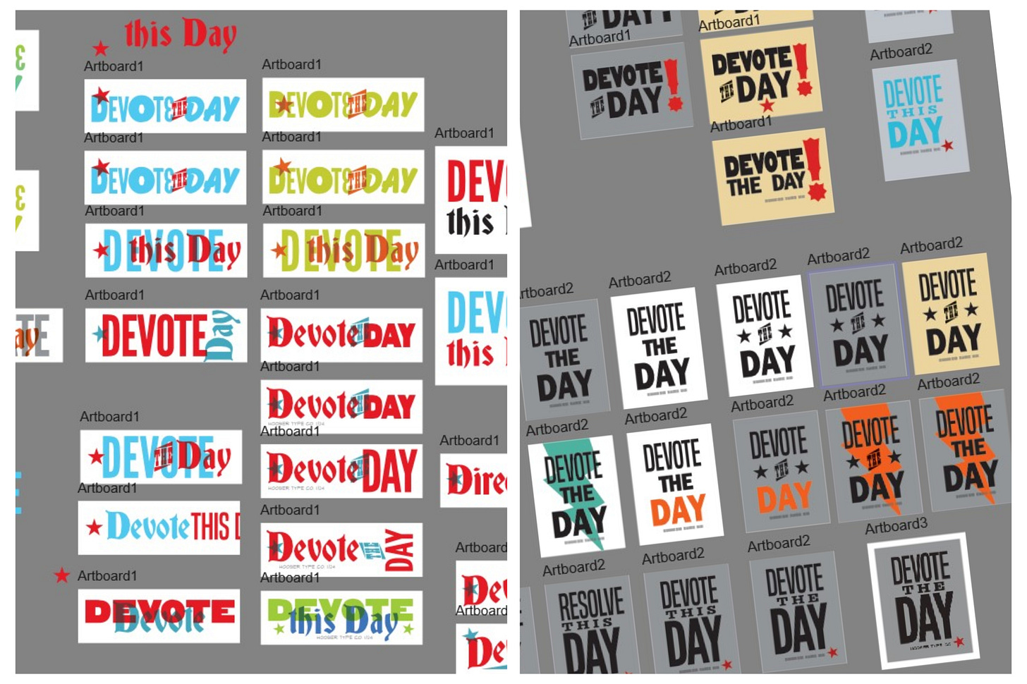
Digital design allows me a lot of flexibility to experiment with very little risk or cost. For this print, even as simple as it is, there were over 50 investigations exploring paper size, fonts, colors, arrangement, and the phrase. There were also physical block-ins made using the wood type to make sure the type I was considering would actually fit on the page.

I eventually landed on a vertical 6x8” page, but I was having problems finding a layout that I felt did justice to the phrase and idea. I needed something noble and somehow elegant.
After several back and forths with a designer friend of mine (thanks, Mike!), I finally found what I needed: the Van de Graaf canon.
The Van de Graaf canon (a system for page layout) was designed as a type of geometric “summary” of our design lineage, influenced by the proportions of ancient texts, scribal writings, and early printing. To over-simplify: an “average” of how a classically designed page is presented. (This is in contrast to, for instance, mass market paperback books where the page is filled to the maximum with little consideration for space on the page.)
I first learned of this page shaping method from Jan Tschichold’s book The Form of the Book, nearly 20 years ago and the concepts have stuck with me ever since. And it was the perfect solution for this print!
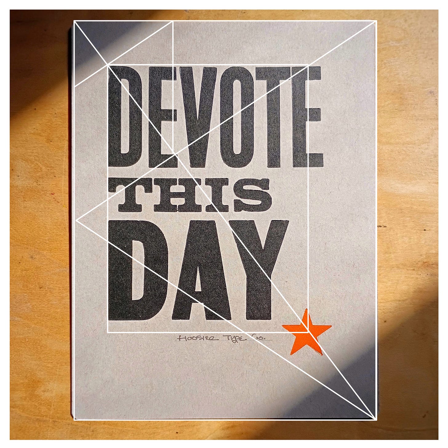
It’s a simple concept. A set of geometric proportions and rules that govern how a spread (set of two pages) can be laid out. I had to take some liberties with the construction, but I was still able to mimic the basic concept:
Van de Graaf canon simplified
Left aligned body of type
Elevated on the page
with more space on the right (or outside) than the left
with the boundary of the implied “paragraph” within a shape repeating the shape of the page.
You can see in the image below the canon superimposed upon the final print. Not a perfect application, but I think the general feel was maintained. If the inner frame is enlarged just a tad and kept on the diagonal correctly, it works much better and is an appropriate use of the canon in my opinion.
I hope this all gave you an interesting peek into the importance of negative “unused” space in design, as well as the thought and craftsmanship I integrate into my letterpress design process. I think it’s difficult for modern audiences who are only accustomed to digital tools to imagine the complexity of this design craft sometimes. Hopefully today’s entry helps!
If you enjoyed this article and appreciate this print, you may support my small design practice by purchasing this print here:
https://hoosiertypeco.etsy.com/listing/4368429341
Any questions or comments? You can reply to this email or comment on the post in Substack and I’ll reply as best as I can!
-Daniel
Thanks for Reading!
I deeply appreciate all the followers and interactions I am having here on Substack. Thank you for the gift of your time and attention to my letterpress design work!
*I do not have paid subscriptions turned on yet, but for those of you who are interested you can “pledge” ahead of time to my newsletter as a way of supporting my studio in advance.
Subscribe, Follow, Share, Wish-List, Invite
You can support my small, rural studio’s design & printing journey by subscribing here on Substack, following on Instagram, sharing this article, adding my prints to your Amazon wish list, or inviting me to speak to your group or class.
Growing a letterpress design practice in rural Indiana is a real challenge, but it’s worth it when I see so many of you enjoying my prints and engaging in discussions on fonts, design history, and creativity! Every little bit helps!
Thanks again for reading along and for all your support!
-Daniel


Daniel, have you heard of https://letterformarchive.org/ ?
I used to support a wonderful Letterpress project called Double Dagger (no longer around unfortunately but their prints were stunning) >>>
https://letterpressworkers.org/double-dagger/
Happy to connect with your process.
Thanks for the good reminders and new insights here!