

Rescuing Wood Type
My summer project to bring a tray of forgotten type to life.

A Unique Find
In early April I stumbled upon an antique tray of type (numerals only) for letterpress printing. It was large and unique, two qualities that make for a good addition to my type cabinet. I just had to have it: bold, sans serif type, in the inline style.
I snatched it up and tucked it away, knowing that my other design & printing commitments would slow down at the beginning of the summer, making room for me to attend to this new-to-me font.
When I had time to inspect it, I was very surprised to discover a couple things:
First, they were in regimented, multiple widths: thin, regular, and extended - with each size being designed at the exact same width across the numbers. This was a very cool find, the analog precursor to modern variable width fonts! In antique typography, the different widths had to physically exist and it was so exciting to find a set with multiple widths to view and use together.
Second, I was surprised that the type was unfinished! I even did a quick scratch test on a non-printing surface to confirm it. This was very unusual. As far as I know all antique wood type manufacturers would have sealed and sanded the wood planks before the designs would have been carved.
So, why was this type unsealed? Was it a test of some sort? There were annotations on a couple of the faces of the numbers, which was also unusual. And who made it? What was the name of the font? And why was it in multiple widths?
Unfortunately, further investigation would have to wait. So, the type was tucked away for later, even if it was often at the forefront of my mind!
A Little Help from my Friends
Finally, June arrived and my studio schedule lightened. It was time to focus on that mysterious tray of type.
The primary task at hand was to finish the type so it would print well.
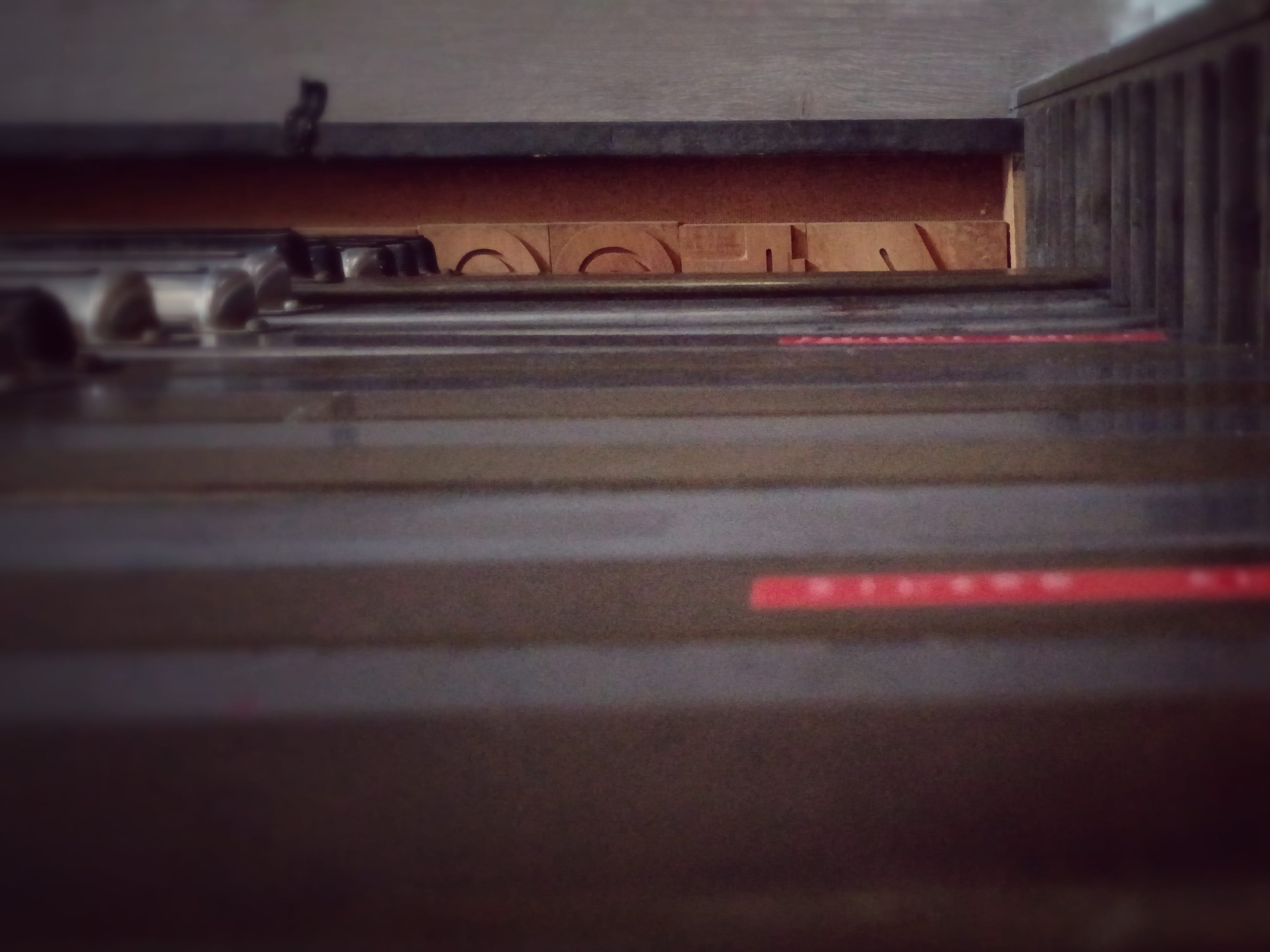
The wood blocks needed sealed with shellac and sanded with fine-grained paper multiple times in order to create a nice, printable surface. Wood that is unfinished will soak up ink, and most likely unevenly. This wastes somewhat expensive ink and creates inconsistencies in the printing surface. I like texture and the accidental nature of printing with antique wood type, but even I have a limit!
I ended up applying three passes of shellac followed by three rounds of sanding — not a quick process when drying times are included.
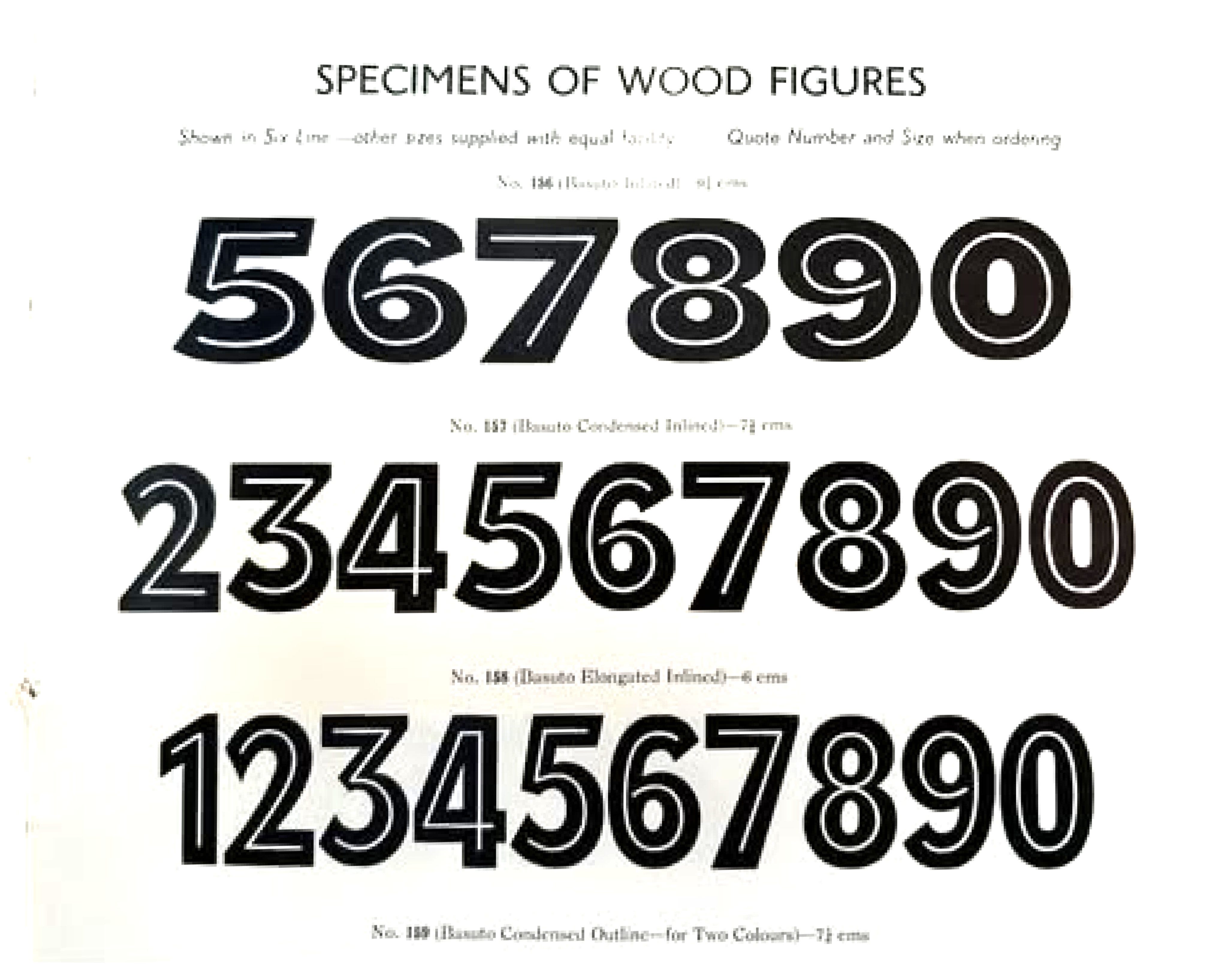
In the meantime, I also reached out to other designers and printers on the internet for help identifying the font. Within 45 minutes, a post on Instagram revealed the name of the font (Basuto!) thanks to a designer from Brazil, Fernando Mello (Fermello78 on Instagram.) Then, another designer, Mark McKellier (also on Instagram) from the UK also was able to identify it and sent me a picture from a 1954 type specimen from Stephenson, Blake, & Co. that confirmed the manufacturer and typeface name. Another inquiry on Facebook found a surprise connection to a gentleman named Robert Paul Richardson that was able to accurately date the maker’s mark on the side of the type, or at least its earliest possible manufacturing date (the earliest would be 1940).
It’s simply amazing how much knowledge others are willing to share on the internet! There is absolutely no way I would have been able to identify this design so quickly or with such high quality references on my own. I owe so much to such a generous network of designers (on this project and many others) that have been willing to assist me over the years. I am still amazed at how the internet has allowed me, a small-time designer and printer in the middle of nowhere Indiana, to connect with so many amazing designers and thinkers - what a time to be alive!
The Missing Pieces
This was the most work I have put into identifying a font. Often, a design is so common that it is easy to put a name to (Concave Tuscan). Or, I simply will describe it using terms and attributes for my own reference (4” French Clarendon Condensed, for example) if a perfect ID isn’t needed.
*It is worth noting here that many type designs were “borrowed” between manufacturers and so the same (or highly similar) designs may show up in multiple places but with different names. Additionally, some fonts have different names in different markets. Futura, for instance, was initially used in Europe for Paul Renner’s famous design, with the name Spartan briefly being used in the US market for the identical design. Finally, some early font names are nearly useless in conversation and are simply a catalog reference number.
But this new acquisition required an accurate identification. Why?
Because it was missing two characters: Regular 3 and Extended 5. And I really wanted that extended 5! This would require making my own and I wanted it to be as historically and typographically correct as possible to respect the original design and designer’s work.
At first, it was my plan to analyze the other blocks to find proportions and extrapolate what the missing designs might have been using some simple type design principles.
However, with an accurate font identification, I could now recreate the correct designs for the missing numerals! I began the work on the extended 5, carefully redrawing the design from the provided catalog specimen and checking measurements against inked proofs of the type I have in hand. The final drawing was then laser engraved into wood (and sanded and sealed) to construct a new, printable 5 that matches the rest of the drawer of original type.
*Full disclosure: I made a couple small, editorial decisions for the design of the 5 that more closely aligned it to the type I had on hand and helped balance the design: the alignment of the inline needed a minor adjustment in two spaces, in the tail and the shoulder. Also the middle inline joint was a compromise between the specimen and how that joint was handled elsewhere.
The Proof is in the Print
Finally, the time had come for the first proof!
A proof is literally “proof” that the type will print (and hopefully print well!)
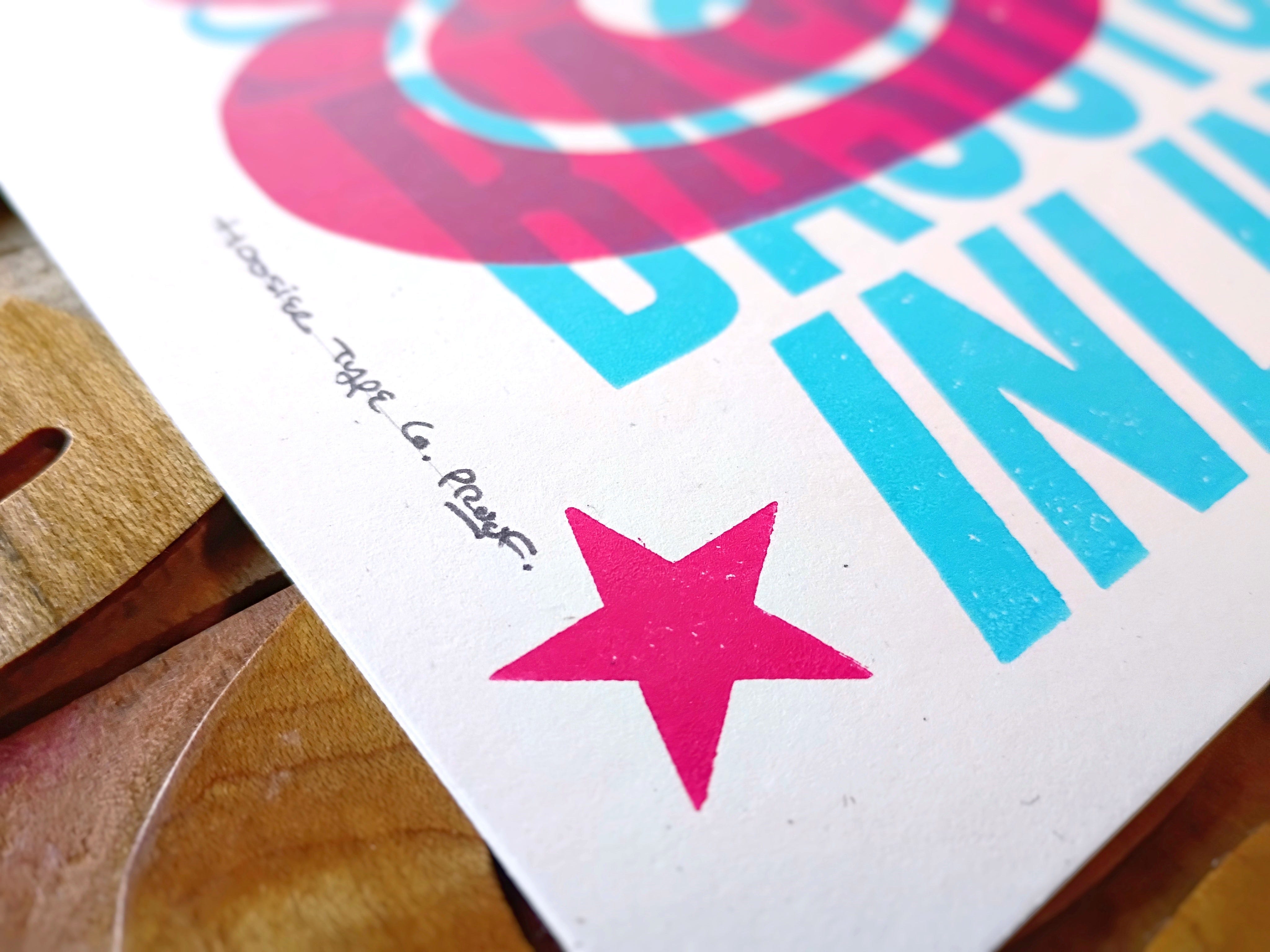
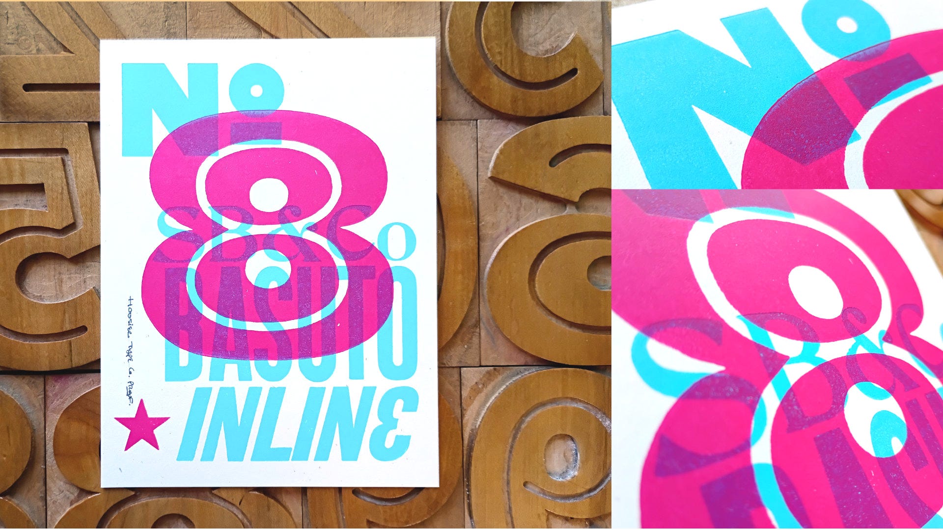
I picked the number 8 for the bold form and symmetry, and simply locked it into the proof press with magnets and a makeshift tension bar across the press bed. I chose a favorite magenta ink and squeezed out just a bit before rolling it to a thin, consistent layer to ink the block.
The first pull was a little weak and speckled — a pressure issue and easy to fix with more pressure or a bit more ink. I chose the latter and was able to get a nice, clean proof with just the perfect amount of surface character (small knicks and scratches from age and handling). It was so exciting to see this type perform after decades of it waiting patiently for a designer and printer who cared enough to bring it to life.
And what a relief that my process and work had yielded beautifully printing blocks!
Help me Celebrate Design History
To celebrate this typeface, a lovely, small slice of design history, I will be hand printing “made to order” type specimens of the individual extended numbers. Each 6x8” print will be a “perfectly imperfect” piece of letterpress love for you to enjoy in your own space.
UPDATE: PROJECT COMPLETED! PRE-ORDERS CLOSED, PROOFS AVAILABLE
Nearly four months after I first acquired the type to when the final print was sent out, the Basuto project is completed!!
I’m glad I gave myself several weeks to make the final prints. It allowed me plenty of time for fine-tuning the height of the different printing blocks to get the impression just right (also I had to reprint the light blue backgrounds twice: once because of a font error and the second time because the star was printed in the wrong color!)
Sure, this project was a lot of extra work and my perfectionism slowed me down several times, but I want to take pride in my prints that are invited into other people’s spaces.
And let me tell you, I’m absolutely thrilled with these finished prints. They were well worth the work!
It has been so amazing to see this type come to life! The mix of graphic design, printing, typography and font design, and design history was an energizing experience for me. And even more so watching so many of you follow along on the journey. I really hope to find more projects like this to dive into in the future!
Growing a new-to-me letterpress design practice in rural Indiana is a real challenge, but it is worth it when I see so many of you enjoying my prints and engaging with my posts on fonts, design history, and creativity!
Thank you for reading along and for all your support!
-Daniel
THANK YOU to everyone that participated on social media and all of you that pre-ordered a custom print. It was a joy to make them for you!
I would love to do more work like this, which celebrates design history and typography through the years and around the world simply for the sake of it. But it requires time, effort, investment - and community.
Here are two ways you can celebrate design and support my small, rural studio:
Printer’s Proofs
Order Your Own 6x8” Basuto Printer’s Proof
In the process of making the final prints several test prints, rejects, and remnants were generated. (And this project made even more of those than a typical project.)
I am making Proofs available through my Etsy at a lower cost of $24 each. Each one is a unique small celebration of design and antique printing for your own space. Printed on the same, heavy speckled white paper as the original editions, just a little more “perfectly imperfect” than the final pre-ordered prints that went out.
I only have available what is listed and shown in the photos in the Etsy listing. These are un-numbered prints, and simply labeled as “Proof.”
Link below. Available while supplies last.
https://hoosiertypeco.etsy.com/listing/4348700782
Subscribe, Follow, Share, Wish-List, Invite
You can also support my small, rural studio’s printing adventures by subscribing here on Substack, following on Instagram, sharing this article, adding my prints to your Amazon wish list, or inviting me to speak to your group or class.
Growing a letterpress design practice in rural Indiana is a real challenge, but it’s worth it when I see so many of you enjoying my prints and engaging in discussions on fonts, design history, and creativity! Every little bit helps!
Thanks again for reading along and for all your support!
-Daniel
www.instagram.com/hoosiertype.co
P.S. - Questions about the printing process, font history, or printing/book arts? Leave a comment below!


I placed an order for that beautiful reconstructed 5 yesterday. It will take pride of place next to a print of Figure 5 in Gold by Charles Demuth. Thank you!
Fascinated by the trail this font had left, and it’s great that you are breathing new life into it 😊
Sorry that your store does not include the UK re delivery though