

A New Font from Old Type
My special summer project to breathe new life into an antique letterpress typeface

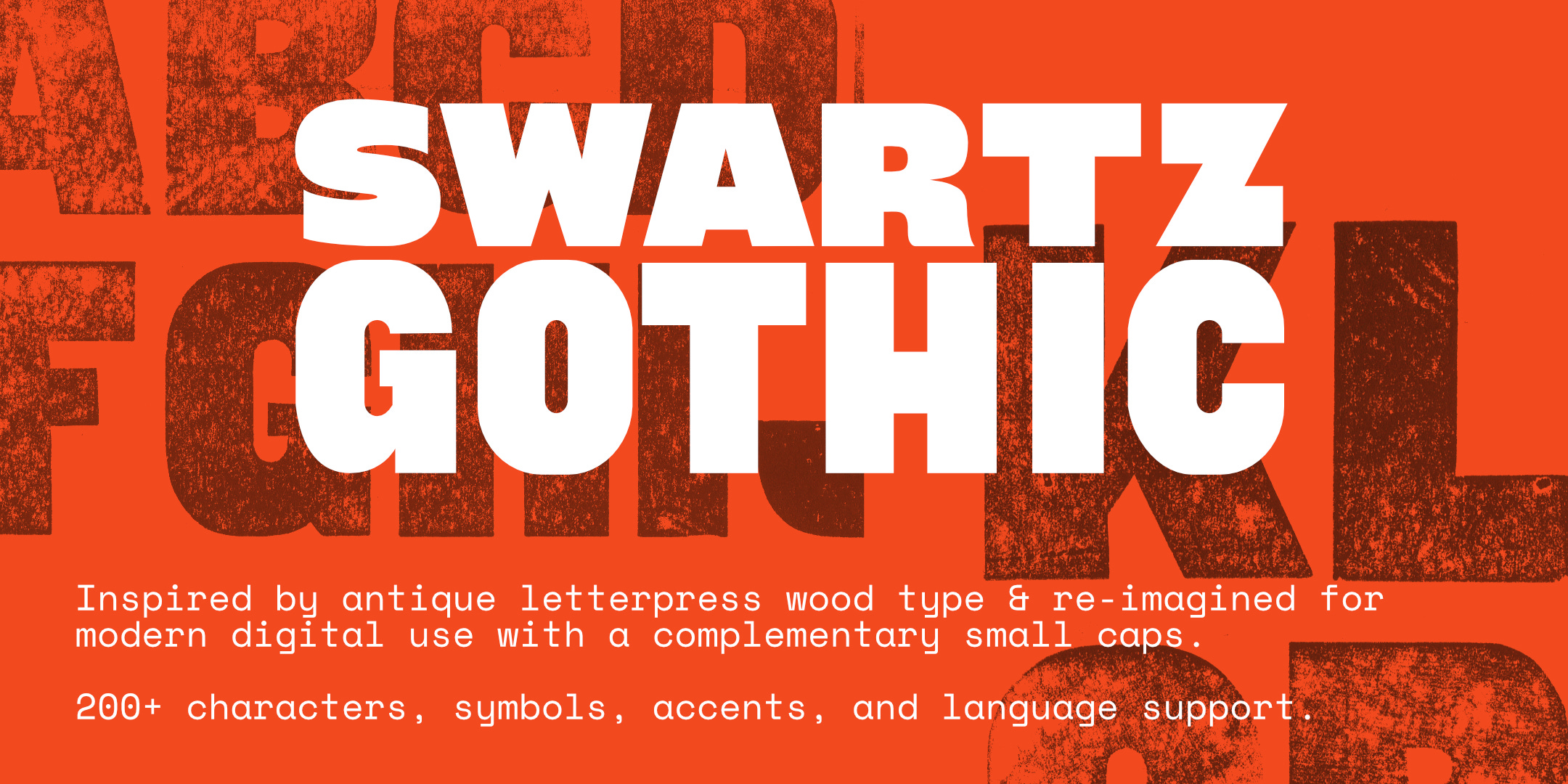
I’m very excited to announce I’ve finished designing my very first font! I’ve been dreaming and reading and experimenting for nearly 10 years and I finally came upon the right idea, resulting in my newly released font: SWARTZ GOTHIC.
I’ve turned June into my month for “special projects.” It’s usually a slower month as people are spending more time outside and vacationing and taking part in all the events that the warmer months allow, but that comes at the expense of less activity online, including social media and online sales.
So, to make use of the extra time and to flip the month into something I look forward to instead of dread, I spend the previous year keeping my eyes open for something special to do. Something new, or unique, or a little more niched that what I may usually make.
For this June, I began a “typeface revival” project which eventually grew into something much grander. A typeface revival is the process of redrawing an old font for new, digital use. But the more I worked with this antique typeface, the more possibilities I began to see!
A couple years ago or so I came across a small mixed lot of letterpress type, containing beautiful 2” letters: bold, with repeated rounded corners, and a little bit of quirkiness. Unfortunately, I didn’t have a full alphabet and there was at least one character that wasn’t from the same font, so I began regularly searching for matching letters to complete the set.
Article continues below…


Finally, several months ago I came across the font on an auction site — and it was a nearly complete set! All of the letters were present, but only a six and an apostrophe were included outside of that.
It was thrilling to finally have the right type in my hands, and when June finally rolled around, I cleaned the font and compared it closely to the odd lots I already had on hand. I wanted to make sure, as well as I could, that both fonts were the same so my source material for redrawing was consistent.
As far as I can tell, both the original and the new acquisition were the same font. There was no maker’s mark present, so I relied upon my own observation to confirm their design.
A few of my checks included inspecting the stroke weight to see that they matched, comparing the widths of matching characters, and even examining the wear marks from the wood planer used in their manufacturing - a detail that can be used to confirm that wood type likely came from the same source.
I was a little concerned that the G showed a slightly different width across samples. It can be difficult to identify wood type well, for a few reasons: first there’s no rule saying a manufacturer couldn’t make revisions to their type over time which could lead to small variations, and secondly, it seems as though it was not uncommon for manufacturers to copy others’ designs with or without variations. And even a close copy might yield the difference I saw in the G, which was roughly the width of a pencil lead.


Beginning the Drawings
Starting this project was straightforward: lockup the type on the press, make a proof print to scan, and begin carefully digitally tracing the characters.


From the beginning, I had already noticed there were a few characters I wanted to make minor adjustments to. And I had the idea that if my changes were limited enough, I might cut new printing blocks for a few letters which could be substituted into the original font for printing.
However, the original list of changes immediately began to grow:
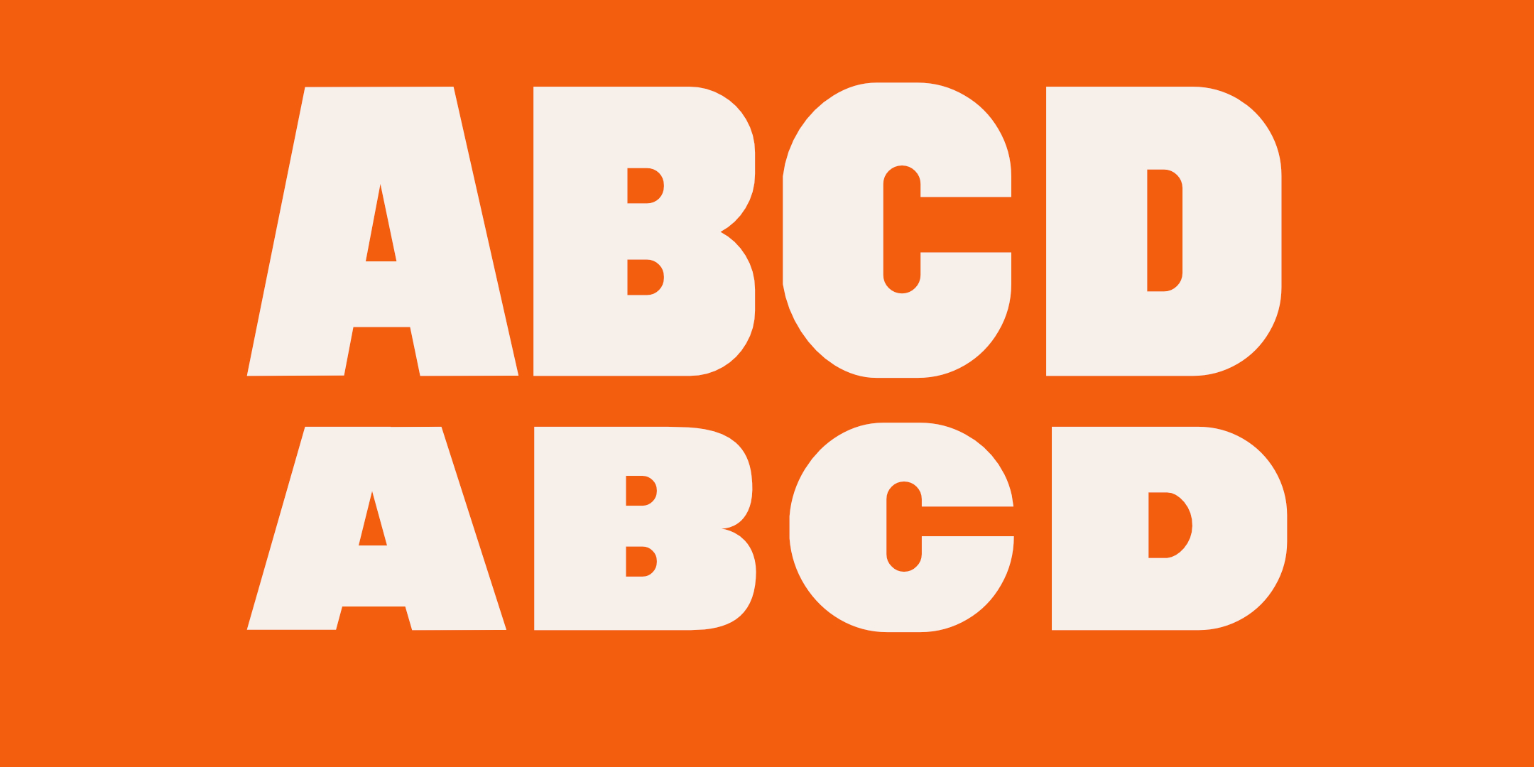
Expand the E and F, they were thinner than several other characters and looked too light against other characters
The P had too much negative space in the lower half and complicated spacing and rhythm
The J also had too much negative space and needed fixed
And the S needed entirely redrawn


Imperfect Patterns
As I began to draw the characters I noticed several consistencies and inconsistencies. These were likely either a product of their tools and processes or an artifact of typeface design from possibly as far as 150 years ago.
Fortunately, there was a lot of repeated sizes and dimensions which meant that I could re-use different shapes and guidelines. For instance, most of the stems (tall vertical strokes) were the same width. The top and bottom horizontal strokes were usually very similar. The negative, rounded shapes (counters) repeated just a couple different sizes, probably because of the router bit used to cut them. The external rounded corners had very similar ratios.
While re-drawing each character, I usually aimed for the most consistent decision first, then I would make “optical” adjustments so the weight would feel correct alongside other characters. And through the process it quickly became apparent that each and every character was going to need some kind of adjustment to make the design work well across letters and be visually consistent across words…which put an end to my idea of cutting just a few new characters for printing.
One particular challenge was the fact that some numbers contained unusually thin and curved strokes, which felt much less machined than other spaces.


I avoided these thin spaces at first, instead drawing many of the “easy” characters that were mostly made from straight lines to begin the project. But eventually it became necessary to tackle these more difficult ideas.
Although I’m glad I’m waited, it was working with these more quirky design decisions that actually unlocked the overall “flavor” of this font.
I redrew the G to mimic the 6 more and leaned into integrating these small spaces, instead of repeating the odd “foot” of the G that was originally present. The R allowed me to push this thick and thin contrast more as well. These may seem like fairly unimportant decisions, but when those characters are repeated frequently in a line of text, it changes the flavor significantly.
Short and Sweet
The wood type I had on hand included no lowercase characters, but I wanted to have something available for those who chose to use my font in their own work. I did some research over a few days trying to locate this exact font design, but I don’t know that I was ever successful. The closest I came was a font from American Woodtype in Windham Conneticut, from a catalog sample circa 1885. I discovered this catalog page via an online archive from the Harvard Library, it contained a design labeled as “Class O, #265 - 8 line” and was extremely close.
On the same page was displayed a matching lowercase, with only handful of letters. Sadly, although legible, the designs were uninspiring and lacked the strength of the uppercase.
And so, I decided to draw an entirely new lowercase, but crafted as “small caps” - short, uniquely drawn versions of the uppercase. One by one I worked through each of the characters, making the new designs 30% shorter but using very similar stroke weight so that the lower case would compliment and not clash with the uppercase so they could be used together well.
It wasn’t until I began drawing the fractions that the cohesive design and look of the font really began to come into focus.
In order to make the numerals small enough for fractions, I decided to try and draw them at 70% of the cap height as well. The 1 and 4 are fairly straightforward. But when I worked on the 2, I found a high contrast design with a very thin diagonal. I loved it!


….but it needed incorporated in other ways for the font design to remain harmonious.
I was struggling with the question mark design and had gone through a few iterations when it struck me that I could use the new “small caps” 2 as the top! It seemed like too perfect of a solution and introduced an oval, instead of a rounded rectangle as well. That then solved a problem with the exclamation mark. The inclusion of thinner spaces also helped me figure out the lower case s and eventually my favorite character: the ampersand!
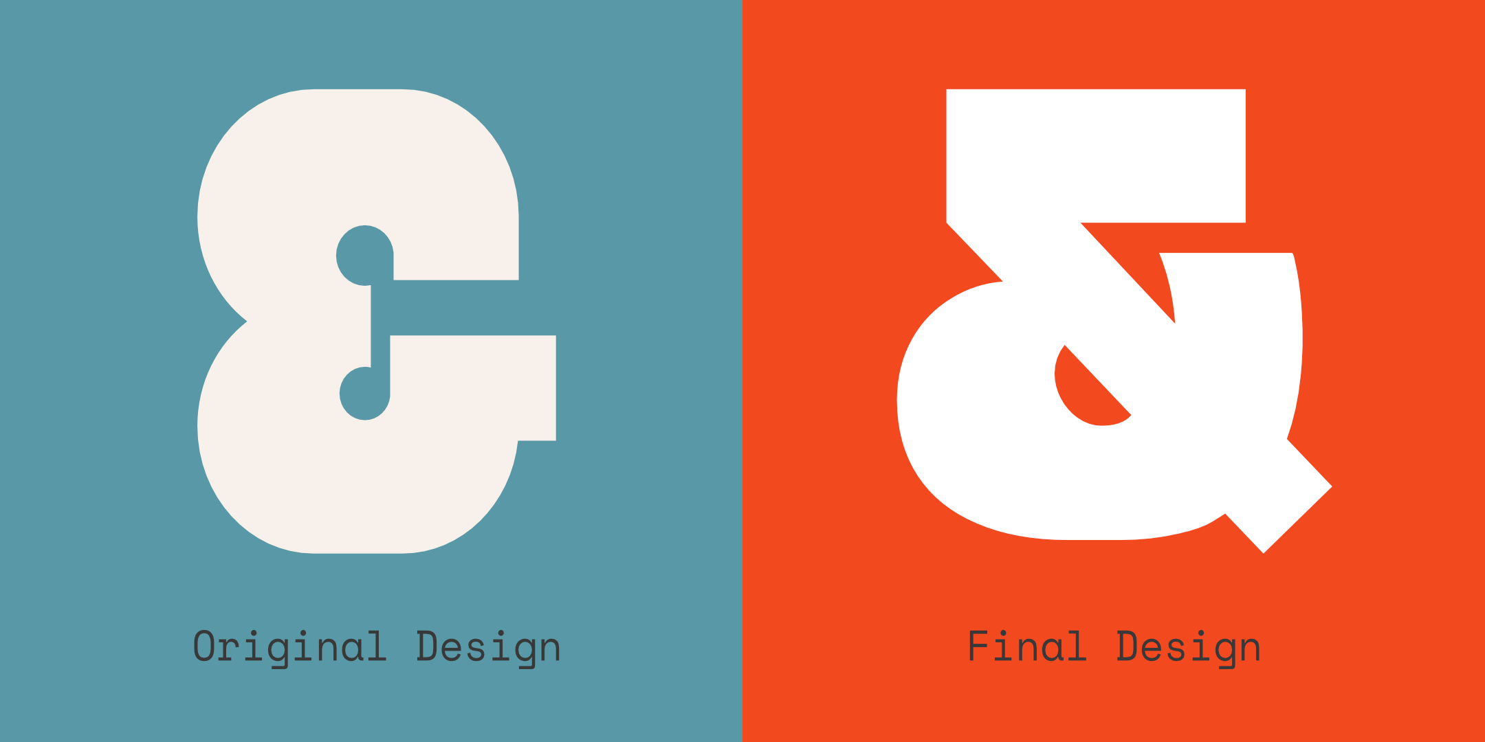
Throughout the project there was repeated redrawing, proofing, testing, and redrawing again. There is extensive revising and reconsidering as the design of each letter affects the presentation of words and sentences.
And it was all worth it though to finally have a finished and polished font!
It’s not a strict “typeface revival”, but I hope I have respected the original design intent and improved upon it to make something even stronger and more beautiful for others to use today!
This was a great use of a slower month if you ask me!
I hope you love it as much as I do.
And I hope you’ll grab a copy for yourself as well.
You can support my work and get your own copy of Swartz Gothic here:
https://hoosiertypeco.etsy.com/listing/4527926075


Utterly Awesome Sauce !!! Well drawn !!! ⚡⚡⚡
This is great…intrigued by each step and the thoughtfulness behind even the smallest of decisions. Really well done :-)